 |
ImprovementsIllustrated Topics |
Topic Codes
_AA |
Architecture |
_AN |
Analytics |
_BR |
Branded Logistics |
_CD |
Construction Documents |
_CI |
Contextual Improvements |
_CT |
Contextual Terrain |
_DB |
Design-Build |
_DD |
Design Development |
_DO |
Design Options |
_EG |
Egress Issues |
_EN |
Enabling Work |
_FM |
Facility Mapping |
_IN |
Interior |
_KK |
Structure |
_LL |
Logistics |
_MA |
Model Articulation |
_SB |
Schematic Design Completion |
_SD |
Schematic Design |
_SO |
Site Orientation |
_SS |
Sitework |
_SX |
Excavation |
_TC |
Traffic Channelization |
_UU |
Utility Issues |
_VL |
Construction Validation |
_YY |
Demolition |
Contextual Major Improvements
Skip ahead to a menu of examples
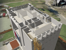
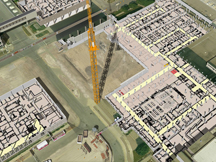
One way to make construction illustrations more convincing is including fairly accurate and proportional renditions of neighboring major improvements in the context which surrounds the worksite. The advantages include an audience’s recognition of the improvement, an ability to interact with the improvement when construction engages it, and backdrop. When an audience can intuitively recognize the context in an image, your team will spend less time fielding orientation questions. The illustrations can even hold their own in front of user groups or as part of printed or persistent communication campaigns, describing its location without words or narration. Because the context is convincingly and proportionately rendered, the audience will be prone to accepting the imagery as a whole as a “realistic” depiction. A proposed project may engage a major improvement as a renovation, addition, or tie-in. In these cases, contextual major improvements are key parts of any illustration of the work. Better definition of such engaged improvements is merited. “Backdrop” is the context surrounding the subject of your illustration. Illustrations of the subject divorced from the context that surrounds them are unnatural to the average audience member — Buildings don’t float in “hyperspace”; connection with the ground plane is a minimum. These are appropriate when presenting to technical or professional audiences, like engineers, architects, and some facility managers, but will present confusion to other people, some with a great deal of influence. You’ll reach more minds if you refrain from the visual equivalent of “shoptalk”. Convincing context is a powerful tool that acts to clarify your illustrations and reduce audience confusion.
Is context worth the price?
Surely the development of context requires time and money. Is clarity of communication worth the price? Will eliminating questions like “okay, which way is Johnson Hall? I’m confused” require valuable time at the interview? Will that question disrupt the flow of your presentation? Will reducing thoughts like “I don’t understand which way we’re looking” be worth the time and money you’d have spent on at least some key context? Consider that some people, especially those in high position, aren’t eager to signal that they are “lost” in your visualizations. This may mean you’ve already lost the bid or missed your objective. In addition to featuring context, that context must be rendered convincingly. Consider you’ve included a neighboring building but it “ain’t quite right” to the audience. Now they’re thinking “something’s wrong with this picture”, eroding the effectiveness of your message. There is a diminishing return for detail and scope, so you must balance “getting it right” with an efficent and effective portrayal of context. “Convincing context” represents the ideal balance-point between “accurate” and “efficient”. There is no magic calculus to compute the balance point: it requires a judgment call. You may be thinking, “if we have the potential to screw up the context and cause the audience to dismiss our message because of it, why include context? Your point is moot.” The advantage of having context that may be a little off but still orients the audience and invites them into the visual tends to outweigh any concern most may have about accuracy. Your team can also explain the defect upfront or when asked to disarm the concern. The point of using visual aids or illustrations in a presentation or printed communication is to more efficiently communicate to an audience, or to communicate using the visual channel in addition to verbal means. Why develop confusing, counterproductive visuals? Developing limited convincing context in your visuals makes sense.
Subjective conclusions are sticky
It is important to keep in mind that it is the presenter’s responsibility to ensure content is substantive and honest, so as not to take advantage of the audience or abuse the visual aids. Convincing visuals with substantive messages are powerful tools. Flashy visuals with little or misleading messages will eventually be regarded by the thoughtful audience as superficial or untruthful. These subjective experiences will telegraph into an audience’s perception of the presenter and the organization represented. Honest, clear, and substantive visuals contribute to the general perception of the presenter. Work with the grain and speak truth to your audience aided by the power of convincing construction visualization.
Examples
Here are a half dozen examples illustrating the application of convincing contextual improvements. Click on an image below to visit an Example Page.
This page last modified Friday 14 December 2012.


