 |
Worksite ContextIllustrated Topics |
Getting things right around the worksite
Part of Vinci LLC’s concept of “convincing” construction visualization is a proper acknowledgement of the existing condition on and around your worksite. It doesn't mean exhaustively detailing everything known to man in a ten mile radius of the site. It simply means spending a little energy to get important things right.
Major Improvements clarify your message, helping your audience orient themselves and “buy in” to your construction concept. They set the stage for discussions of real estate development, especially on campus. Adjacent context is often engaged by a construction project; inclusion of context is key to effective user group communication.
Demolition, addition, and renovation are best served by a properly detailed existing building. This enables cross sections and street views that demonstrate the completeness of your strategy.
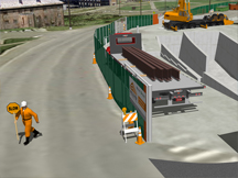
Safety, wayfinding, and traffic channelization are richly supported by the definition of key minor improvements that have an affect on your worksite and the lives of people circulating around it.
The convincing definition of existing improvements is indispensible for any campuswide construction endeavor.
Examples of Worksite Context
Here are one dozen three examples of contextual improvements in virtual construction visualization. Click on an image below to visit an Example Page. Check out the blue links for further examples or information!
 |
 |
 |
|
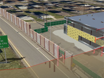
No construction happens in a vacuum! Acknowleding major and minor obstacles in your construction strategy proves the robustness of your team’s plan. |
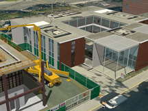
Getting the worksite context right helps your team understand the worksite and better conveys your team’s strategy to the Owner. |
Getting the neighbor right helps validate your strategy, as your work often involves your neighbors . |
 |
 |
 |
|
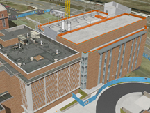
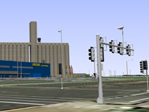
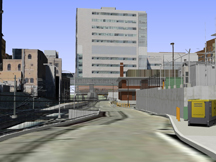
Properly developed major and minor contextual improvements furnish a rich environment that enables production of street views of your worksite. |
Connections to existing facilities are better rendered given prperly developed adjacent context. |
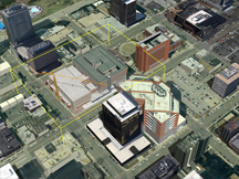
Urban developments indicate proper recognition of near neighbors and existing street improvements, and enable street views of your worksite. |
 |
 |
 |
|
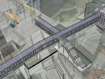
Show ’em your team can work within constraints above and below grade |
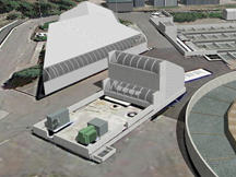
Key minor improvements such as signals, signage, and utilities, can present obstacles or important safety concerns for your construction strategy. |
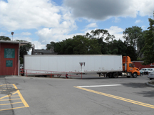
Site photography can be a boon to developing a successful context model, the stage on which your crews will build the Owner’s dream facility. |
 |
 |
 |
|
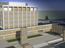
Major Improvements enhance the clarity, helping your audience orient themselves and “buy in” to your construction concept |
Major Improvements set the stage for discussions of real estate development, especially on campuses |
Adjacent context is often engaged by a construction project; inclusion of context is key to effective user group communication |
 |
 |
 |
|
Getting what’s there correct helps your team show how you’ll keep things humming along around the worksite |
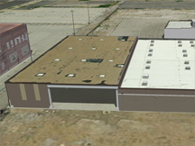
Properly detailed major improvements can help speak to demolition or renovation concerns |
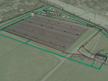
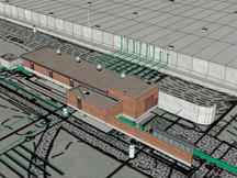
Vinci LLC uses telemetric methods to produce convincing facsimiles of on-site conditions |
 |
 |
 |
|
The total existing condition-above and under ground-helps your team tell a great construction story |
Telemetry, RFP documentation, and your team’s site photos help set the stage for convincing depiction of worksite activity |
Existing context helps tell your construction story |
One way to make construction illustrations more convincing is including fairly accurate and proportional renditions of neighboring major improvements in the context which surrounds the worksite. The advantages include an audience’s recognition of the improvement, an ability to interact with the improvement when construction engages it, and backdrop. When an audience can intuitively recognize the context in an image, your team will spend less time fielding orientation questions. The illustrations can even hold their own in front of user groups or as part of printed or persistent communication campaigns, describing its location without words or narration. Because the context is convincingly and proportionately rendered, the audience will be prone to accepting the imagery as a whole as a “realistic” depiction. A proposed project may engage a major improvement as a renovation, addition, or tie-in. In these cases, contextual major improvements are key parts of any illustration of the work. Better definition of such engaged improvements is merited. “Backdrop” is the context surrounding the subject of your illustration. Illustrations of the subject divorced from the context that surrounds them are unnatural to the average audience member — Buildings don’t float in “hyperspace”; connection with the ground plane is a minimum. These are appropriate when presenting to technical or professional audiences, like engineers, architects, and some facility managers, but will present confusion to other people, some with a great deal of influence. You’ll reach more minds if you refrain from the visual equivalent of “shoptalk”. Convincing context is a powerful tool that acts to clarify your illustrations and reduce audience confusion.
Is context worth the price?
Surely the development of context requires time and money. Is clarity of communication worth the price? Will eliminating questions like “okay, which way is Johnson Hall? I’m confused” require valuable time at the interview? Will that question disrupt the flow of your presentation? Will reducing thoughts like “I don’t understand which way we’re looking” be worth the time and money you’d have spent on at least some key context? Consider that some people, especially those in high position, aren’t eager to signal that they are “lost” in your visualizations. This may mean you’ve already lost the bid or missed your objective. In addition to featuring context, that context must be rendered convincingly. Consider you’ve included a neighboring building but it “ain’t quite right” to the audience. Now they’re thinking “something’s wrong with this picture”, eroding the effectiveness of your message. There is a diminishing return for detail and scope, so you must balance “getting it right” with an efficent and effective portrayal of context. “Convincing context” represents the ideal balance-point between “accurate” and “efficient”. There is no magic calculus to compute the balance point: it requires a judgment call. You may be thinking, “if we have the potential to screw up the context and cause the audience to dismiss our message because of it, why include context? Your point is moot.” The advantage of having context that may be a little off but still orients the audience and invites them into the visual tends to outweigh any concern most may have about accuracy. Your team can also explain the defect upfront or when asked to disarm the concern. The point of using visual aids or illustrations in a presentation or printed communication is to more efficiently communicate to an audience, or to communicate using the visual channel in addition to verbal means. Why develop confusing, counterproductive visuals? Developing limited convincing context in your visuals makes sense.
Subjective conclusions are sticky
It is important to keep in mind that it is the presenter’s responsibility to ensure content is substantive and honest, so as not to take advantage of the audience or abuse the visual aids. Convincing visuals with substantive messages are powerful tools. Flashy visuals with little or misleading messages will eventually be regarded by the thoughtful audience as superficial or untruthful. These subjective experiences will telegraph into an audience’s perception of the presenter and the organization represented. Honest, clear, and substantive visuals contribute to the general perception of the presenter. Work with the grain and speak truth to your audience aided by the power of convincing construction visualization.
This page last modified Monday 11 January 2016.